A vertical dismissible and customizable stack of cards for a Flutter application.
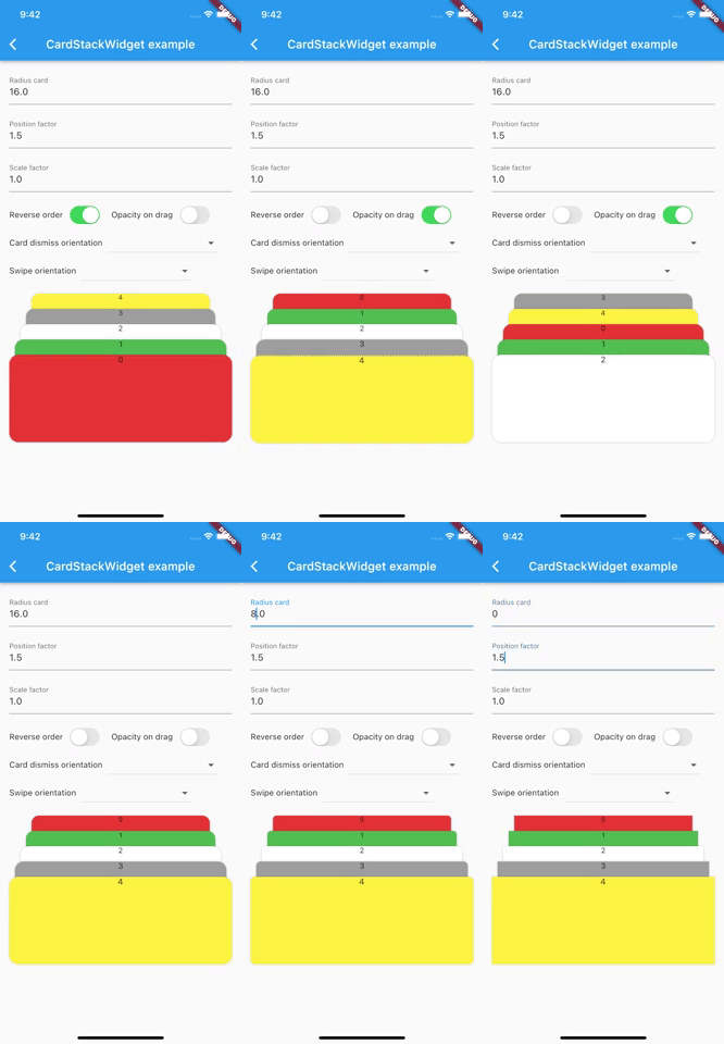
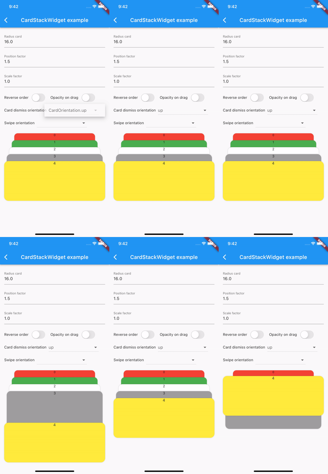
CardStackWidget requires a list of CardModel, in order to create a stack of cards. You can
customize their swipe or dismiss orientation, change the scale or the position factor. You can also
apply an opacity, that change on drag movement.
Below, you can find an example of the usage of CardStackWidget and CardModel:
CardStackWidget _buildCardStackWidget(BuildContext context) {
  final mockList = _buildMockList(context, size: 4);

  return CardStackWidget(
    opacityChangeOnDrag: true,
    swipeOrientation: CardOrientation.both,
    cardDismissOrientation: CardOrientation.both,
    positionFactor: 3,
    scaleFactor: 1.5,
    alignment: Alignment.center,
    reverseOrder: true,
    animateCardScale: true,
    dismissedCardDuration: const Duration(milliseconds: 150),
    cardList: mockList,
  );
}

/// Create a mock list of `CardModel` to use inside `CardStackWidget`
_buildMockList(BuildContext context, {int size = 0}) {
  final double containerWidth = MediaQuery
      .of(context)
      .size
      .width - 16;

  var list = <CardModel>[];
  for (int i = 0; i < size; i++) {
    var color = Color((Random().nextDouble() * 0xFFFFFF).toInt() << 0)
        .withOpacity(1.0);

    list.add(
      CardModel(
        backgroundColor: color,
        radius: 8,
        shadowColor: Colors.black.withOpacity(0.2),
        child: SizedBox(
          height: 310,
          width: containerWidth,
          child: Container(), // Whatever you want
        ),
      ),
    );
  }

  return list;
}
CardStackWidget:
- cardList: List
- scaleFactor: double
- positionFactor: double
- alignment: Alignment?
- reverseOrder: bool
- cardDismissOrientation: CardOrientation
- swipeOrientation: CardOrientation
- onCardTap: Function(CardModel)?
- animateCardScale: Duration
- dismissedCardDuration: bool
- opacityChangeOnDrag: bool
CardModel:
- key: Key?
- shadowColor: Color
- backgroundColor: Color
- radius: Radius
- border: BoxBorder?
- child: Widget?
- padding: EdgeInsets?
- margin: EdgeInsets?
- gradient: Gradient?
- imageDecoration: DecorationImage?