A lightweight React Native library for building app tours, walkthroughs, and coach marks. The spotlight automatically matches your component's shape — circles stay circular, pills stay pill-shaped, no manual configuration needed.
Works with Expo and React Native CLI. Zero native dependencies. New Architecture ready.









📚 Documentation & guides · 📦 Install from npm


If this library saves you a sprint of edge cases, a ⭐ and a coffee keep it maintained.
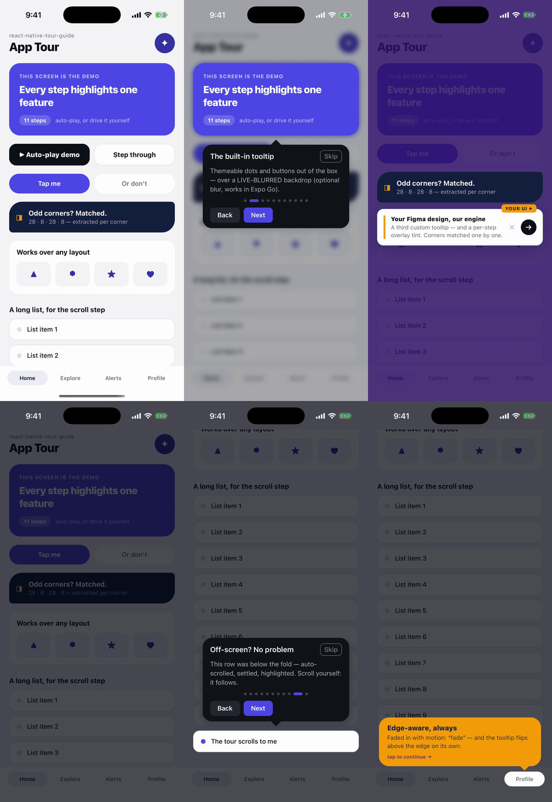
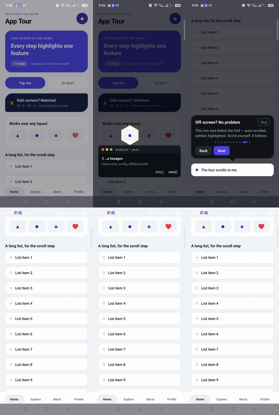
iOS simulator · physical Android device — the same demo, every step a different feature: blurred backdrop, custom Figma-style tooltips, triangle/star/heart cutouts, interactive tap-through, auto-scroll, edge-aware flips.
It creates an overlay that highlights specific components in your app and shows tooltips explaining each one. You define a list of steps (which component to highlight, what to say), call startTour(), and the library handles everything else — measuring elements, positioning tooltips, scrolling to off-screen targets, animating between steps, and matching the spotlight shape to each component's border radius.
| Capability | This library | Alternatives |
|---|---|---|
| Auto shape matching | Spotlight matches target's border radius automatically | Manual shape selection |
| Auto-scroll | Scrolls to ensure target + tooltip both fit on screen | Manual or none |
| Smart tooltip positioning | Auto-detects best position, never renders off-screen | Manual per step |
| Theme presets | 4 built-in + createTheme() API |
None |
| Per-corner border radius | Extracted automatically from targetStyle |
Not supported |
| Pulse animation | Configurable animated spotlight border | Not supported |
| Pause/Resume | Built-in state preservation | Not supported |
| Tour persistence | Built-in "show only once" hook | DIY |
| Conditional steps | active flag with auto-renumbering |
Filter manually |
| Bundle size | < 50KB, zero native dependencies | > 200KB |
# npm
npm install @wrack/react-native-tour-guide react-native-svg

# yarn
yarn add @wrack/react-native-tour-guide react-native-svg

# pnpm
pnpm add @wrack/react-native-tour-guide react-native-svg

# Expo (managed or bare)
npx expo install @wrack/react-native-tour-guide react-native-svg| Minimum | |
|---|---|
react-native |
0.71 |
react |
18 |
react-native-svg |
13 |
react-native-web (web only) |
0.19 |
Works on the old architecture and the New Architecture (Fabric), on iOS, Android
and web. react-native-safe-area-context is optional — when installed, safe-area
insets are detected automatically.
These are only needed for enhanced visual effects:
# Blur effect
npm install @react-native-community/blur

# Gradient overlay
npm install react-native-linear-gradient

# Advanced blur masking
npm install @react-native-masked-view/masked-viewimport { TourGuideProvider, TourGuideOverlay } from '@wrack/react-native-tour-guide';
export default function App() {
return (
<TourGuideProvider>
<YourApp />
<TourGuideOverlay />
</TourGuideProvider>
);
}import { useRef } from 'react';
import { View, Text, Pressable } from 'react-native';
import { useTourGuide } from '@wrack/react-native-tour-guide';
function HomeScreen() {
const { startTour } = useTourGuide();
const buttonRef = useRef(null);
const avatarRef = useRef(null);
const handleStart = () => {
startTour([
{
id: 'welcome',
targetRef: buttonRef,
title: 'Welcome',
description: 'Tap here to get started.',
targetStyle: styles.button, // spotlight matches button's border radius
},
{
id: 'avatar',
targetRef: avatarRef,
title: 'Your Profile',
description: 'Tap to view your profile.',
targetStyle: styles.avatar, // circular target gets circular spotlight
},
]);
};
return (
<View>
<Pressable ref={buttonRef} style={styles.button} onPress={handleStart}>
<Text>Start Tour</Text>
</Pressable>
<View ref={avatarRef} style={styles.avatar} />
</View>
);
}
const styles = StyleSheet.create({
button: { borderRadius: 12, padding: 16, backgroundColor: '#007AFF' },
avatar: { width: 48, height: 48, borderRadius: 24, backgroundColor: '#ccc' },
});That's it. The spotlight around the button will have 12px rounded corners. The spotlight around the avatar will be a perfect circle.
Skip ref-threading entirely: wrap any element in a TourTarget and reference it
from steps by id. The wrapper registers itself with the provider (and uses
collapsable={false} so Android's view flattening can never make the target
unmeasurable).
import { TourTarget, useTourGuide } from '@wrack/react-native-tour-guide';

<TourTarget id="compose" style={{ borderRadius: 24 }}>
  <ComposeButton />
</TourTarget>;

// Steps reference the id — no refs anywhere:
startTour([
  { id: 'step1', targetId: 'compose', title: 'Compose', description: 'Start a new message.' },
]);
The style on TourTarget drives spotlight shape matching, exactly like a
step's targetStyle. If the target mounts after the tour starts (a screen you
navigate to), the tour waits briefly for it to register before falling back to
a centered tooltip. targetRef still works everywhere and wins when both are
given.
By default the overlay uses a Modal, which swallows every touch. Switch to the
inline overlay and mark a step interactive to let touches pass through the
spotlight hole to the actual element underneath:
startTour(
  [
    {
      id: 'send',
      targetId: 'send-button',
      title: 'Try it now',
      description: 'Tap Send to continue.',
      interactive: true,   // touches reach the real button
      hideNextButton: true,
      completed: false,    // Next stays disabled until you say so
    },
  ],
  { overlayMode: 'inline' }
);

// In the button's own handler:
const { nextStep, setStepCompleted } = useTourGuide();
const onSend = () => {
  setStepCompleted('send', true);
  nextStep();
};
overlayMode: 'inline'renders the overlay as an absolutely-positioned layer instead of a Modal. Put<TourGuideOverlay />at the root of your app so it covers the full screen. (The Android back button is not intercepted in this mode.)completed: falsedisables the Next button untilsetStepCompleted(stepId, true)is called — turn a slideshow into a guided task.
Navigate, open a sheet, or wait for data before a step is measured — the
spotlight only appears once the promise resolves. Prefer this over guessing a
delayBefore:
{
  id: 'profile-tab',
  targetId: 'profile-header',
  title: 'Your profile',
  description: 'Everything about you lives here.',
  before: async () => {
    navigation.navigate('Profile');
    await waitForProfileToLoad();
  },
}
If before() throws or rejects, the tour warns (dev only) and shows the step
anyway rather than trapping the user.
Register tours up front and start them by id from anywhere — useful when steps and triggers live in different parts of the app:
const { defineTour, startTour, canStartTour } = useTourGuide();

// At setup time (e.g. app root):
defineTour('onboarding', onboardingSteps, { showProgressDots: true });
defineTour('power-features', powerSteps);

// Anywhere else:
startTour('onboarding');                       // stored config
startTour('onboarding', { motion: 'bounce' }); // with overrides

// Wait until every <TourTarget> the tour references has mounted:
if (canStartTour('onboarding')) startTour('onboarding');
canStartTour also accepts a raw steps array. Steps with targetRef,
targetRegion, or no target always count as ready.
Maps, camera previews, canvases — anything you can't attach a ref to — can be highlighted as a fixed window rectangle:
{
  id: 'map-pin',
  targetRegion: { x: 40, y: 220, width: 320, height: 180 },
  title: 'Your delivery zone',
  description: 'Everything inside this area ships free.',
}
targetRegion skips measurement entirely and wins over targetRef/targetId.
Choose how the spotlight travels between steps — globally or per step:
startTour(steps, { motion: 'bounce' });          // springy, with overshoot
// per step:
{ id: 'step3', targetId: 'send', motion: 'fade', ... }| Motion | Behaviour |
|---|---|
morph (default) |
Position, size and radius tween in one smooth move |
bounce |
The same move on a spring |
fade |
The overlay dips out, jumps, and fades back in |
none |
Instant jump |
The ultimate escape hatch: return any SVG subpath and it becomes the hole in the backdrop (evenodd fill). Overrides shape matching for every step:
startTour(steps, {
  spotlightStyles: {
    // A star, a blob, an arrow — anything you can path:
    maskPath: ({ bounds }) => {
      const { x, y, width: w, height: h } = bounds;
      const cx = x + w / 2;
      return `M${cx},${y} L${x + w},${y + h} L${x},${y + h} Z`; // triangle
    },
  },
});
The function receives the measured target, the padded bounds the automatic
shape would use, and the screen size. Custom paths jump between steps (arbitrary
paths can't be tweened reliably); a throwing maskPath falls back to the
automatic shape.
Bind your scrollable to the tour with useTourScroll, and with
followTarget: true the spotlight and tooltip stay glued to the target while
the user scrolls freely:
import { useTourScroll } from '@wrack/react-native-tour-guide';

const { scrollProps } = useTourScroll();

<ScrollView ref={scrollRef} {...scrollProps}>…</ScrollView>;

startTour(steps, { scrollRef, followTarget: true });
Wiring useTourScroll also gives the tour two more things for free:
- Exact auto-scroll settling —
onMomentumScrollEndtells the tour the programmatic scroll finished, so the highlight lands immediately instead of waiting for position polling to detect the stop. - A tracked scroll offset —
getCurrentScrollOffsetbecomes redundant.
Have your own onScroll? Compose it: the hook also returns the individual
handlers.
Subscribe once — e.g. at app root — instead of threading callbacks through every tour config:
const { events } = useTourGuide();

useEffect(() => {
  const offs = [
    events.on('start', ({ tourId, totalSteps }) => track('tour_start', { tourId, totalSteps })),
    events.on('stepChange', ({ from, to }) => track('tour_step', { from, to })),
    events.on('end', ({ completed, tourId }) => track('tour_end', { completed, tourId })),
    events.on('skip', ({ at }) => track('tour_skip', { at })),
  ];
  return () => offs.forEach((off) => off());
}, [events]);
Events: start, stepChange, end, skip, pause, resume. A throwing
handler is isolated — analytics can never take the tour down. The config
callbacks (onTourStart etc.) still work; both fire.
useTourPersistence() now auto-detects storage — MMKV (v2–v4) first, then
AsyncStorage:
const { startTour } = useTourPersistence(); // no adapter needed
startTour(steps, { tourId: 'onboarding' });
With neither installed it falls back to in-memory storage (the tour works, completion just isn't remembered across restarts) and says so in a dev warning. Passing your own adapter still works and always wins.
keepSpotlight: true on a step keeps its hole punched out of the backdrop
after the tour moves forward past it — for "these three things work together"
storytelling:
startTour([
  { id: 'a', targetId: 'search', keepSpotlight: true, ... },
  { id: 'b', targetId: 'filters', keepSpotlight: true, ... },
  { id: 'c', targetId: 'results', title: 'Together…', ... }, // all three lit
]);
Kept holes are visual only (no pulse, no touch pass-through) and are dropped when the user navigates back.
The layout-tuning config fields accept { ios, android, web, default }
objects:
startTour(steps, {
  tooltipWidth: { ios: 320, android: 300, default: 320 },
  motion: { ios: 'bounce', default: 'morph' },
});
Applies to tooltipWidth, tooltipOffset, triangleSize,
animationDuration, safeZoneOffset, and motion. Values are resolved once
at startTour; everything you read back from context is already plain.
Pass the same style you use on the component as targetStyle on the step. The library reads the borderRadius properties from that style and applies them to the spotlight.
- Fully rounded elements (where
borderRadius >= min(width, height) / 2) stay fully rounded even when the spotlight is slightly larger - Per-corner radii (
borderTopLeftRadius, etc.) are preserved exactly — the spotlight matches the asymmetric shape - Partial radii (like
borderRadius: 12on a card) stay at exactly 12px on the spotlight
// Chat bubble with asymmetric corners
const chatStyle = {
  borderTopLeftRadius: 16,
  borderTopRightRadius: 16,
  borderBottomRightRadius: 16,
  borderBottomLeftRadius: 4,
};

{ id: 'chat', targetRef: chatRef, targetStyle: chatStyle, title: '...', description: '...' }
// Spotlight will have 16px on top-left, top-right, bottom-right and 4px on bottom-left
You can also override the border radius manually:
// Uniform override
{ id: 'step', targetRef: ref, spotlightBorderRadius: 20, title: '...', description: '...' }
Priority: spotlightBorderRadius > auto-extracted from targetStyle > default (12px).
Set scrollRef on the tour config. The library automatically scrolls to ensure both the target and its tooltip are fully visible. getCurrentScrollOffset is optional — without it the destination is derived from the target's position inside the scroll content (measureLayout), which needs no offset tracking at all. Pass the getter only if you want the offset-based calculation.
const scrollViewRef = useRef(null);
const [scrollY, setScrollY] = useState(0);

startTour(steps, {
  scrollRef: scrollViewRef,
  getCurrentScrollOffset: () => scrollY,
});

// In your JSX:
<ScrollView
  ref={scrollViewRef}
  onScroll={(e) => setScrollY(e.nativeEvent.contentOffset.y)}
  scrollEventThrottle={16}
>
  {/* your content */}
</ScrollView>
This works with ScrollView, FlatList, SectionList, Animated.ScrollView and
gesture-handler wrappers — the library detects each one's scroll method, so you
pass the ref the same way regardless:
const listRef = useRef(null);
const [scrollY, setScrollY] = useState(0);

startTour(steps, {
  scrollRef: listRef,              // FlatList works exactly like ScrollView
  getCurrentScrollOffset: () => scrollY,
});

<FlatList
  ref={listRef}
  onScroll={(e) => setScrollY(e.nativeEvent.contentOffset.y)}
  scrollEventThrottle={16}
  data={data}
  renderItem={renderItem}
/>
Attach the ref to the list itself, not to a wrapping
View. If the ref has no scroll method the tour warns in development and highlights the target where it is, rather than scrolling.
You can also set scrollToTarget per step for fine-grained control:
{
  id: 'far-down',
  targetRef: ref,
  title: 'Scroll Target',
  description: '...',
  scrollToTarget: {
    scrollRef: scrollViewRef,
    offset: 50,
    animated: true,
    getCurrentScrollOffset: () => scrollY,
  },
}Four built-in themes are included. Spread them into your config:
import { darkTheme, lightTheme, minimalTheme, vibrantTheme } from '@wrack/react-native-tour-guide';

startTour(steps, { ...darkTheme });
Create a custom theme with createTheme():
import { createTheme } from '@wrack/react-native-tour-guide';

const brandTheme = createTheme({
  tooltipStyles: { primaryButtonColor: '#FF6B35', backgroundColor: '#1B1B3A' },
  spotlightStyles: { overlayOpacity: 0.7 },
});

startTour(steps, { ...brandTheme });startTour(steps, {
spotlightStyles: {
enablePulse: true,
pulseColor: '#00BFFF',
pulseWidth: 3,
pulseDuration: 1200,
pulseMinOpacity: 0.3,
pulseMaxOpacity: 0.9,
},
});Use the useTourPersistence hook with any storage backend:
import AsyncStorage from '@react-native-async-storage/async-storage';
import { useTourPersistence } from '@wrack/react-native-tour-guide';

function MyScreen() {
  const { startTour, resetTour } = useTourPersistence(AsyncStorage);

  useEffect(() => {
    // Automatically skips if user already completed this tour
    startTour(steps, { tourId: 'onboarding' });
  }, []);

  // Force show again
  const showAgain = async () => {
    await resetTour('onboarding');
    startTour(steps, { tourId: 'onboarding' }, true);
  };
}
Works with MMKV too:
import { MMKV } from 'react-native-mmkv';
const storage = new MMKV();

const adapter = {
  getItem: (key) => storage.getString(key) ?? null,
  setItem: (key, value) => storage.set(key, value),
  removeItem: (key) => storage.delete(key),
};

const { startTour } = useTourPersistence(adapter);Set active: false to hide a step. Numbering adjusts automatically.
const isPremium = useIsPremium();

startTour([
  { id: 'welcome', targetRef: welcomeRef, title: 'Welcome', description: '...' },
  {
    id: 'upgrade',
    targetRef: upgradeRef,
    title: 'Upgrade',
    description: 'Only shown to free users.',
    active: !isPremium,
  },
  { id: 'done', targetRef: doneRef, title: 'All Set', description: '...' },
]);startTour([
{
id: 'step1',
targetRef: ref,
title: 'Tap anywhere',
description: 'Tapping the dark overlay advances to the next step.',
backdropBehavior: 'next', // 'dismiss' | 'next' | 'none' | () => void
},
]);
// Or set globally
startTour(steps, { defaultBackdropBehavior: 'next' });const { pauseTour, resumeTour, isPaused } = useTourGuide();
// Pause when opening a modal
const handleModalOpen = () => pauseTour();
// Resume when it closes — picks up where it left off
const handleModalClose = () => resumeTour();import type { TooltipProps } from '@wrack/react-native-tour-guide';
const MyTooltip = (props: TooltipProps) => (
<View style={myStyles.tooltip}>
<Text>{props.title}</Text>
<Text>{props.description}</Text>
<Pressable onPress={props.onNext}><Text>Continue</Text></Pressable>
</View>
);
startTour(steps, {
renderTooltip: (props) => <MyTooltip {...props} />,
});const {
startTour, nextStep, prevStep, skipTour, endTour,
goToStep, pauseTour, resumeTour,
isActive, isPaused, currentStep, activeTourId,
} = useTourGuide();| Property | Type | Default | Description |
|---|---|---|---|
id |
string |
required | Unique step identifier |
targetRef |
RefObject |
— | Ref to the component to highlight |
targetId |
string |
— | Id of a <TourTarget> to highlight — the ref-free alternative |
targetRegion |
{x, y, width, height} |
— | Highlight a fixed window rectangle (no ref needed); wins over targetRef/targetId |
title |
string |
required | Tooltip title |
description |
string |
required | Tooltip body text |
tooltipPosition |
'top' | 'bottom' | 'left' | 'right' | 'auto' |
'auto' |
Tooltip placement (auto-detected by default) |
targetStyle |
ViewStyle |
— | Style to extract border radius from for shape matching |
spotlightPadding |
number | {top,right,bottom,left} |
0 |
Padding around the spotlight — uniform or per-side |
spotlightBorderRadius |
number |
— | Override border radius (takes priority over targetStyle) |
scrollToTarget |
ScrollToTargetConfig |
— | Per-step scroll configuration |
active |
boolean |
true |
Whether this step is included |
backdropBehavior |
BackdropBehavior |
'none' |
What happens on backdrop tap |
autoAdvance |
number |
0 |
Auto-advance after ms (0 = disabled) |
before |
() => void | Promise<void> |
— | Awaited before the step is measured — navigate/fetch here |
delayBefore |
number |
0 |
Delay before showing step |
completed |
boolean |
— | false disables Next until setStepCompleted(id, true) |
interactive |
boolean |
false |
Let touches through the spotlight to the real element (inline mode) |
renderTooltip |
(props) => ReactNode |
— | Per-step custom tooltip (overrides the config one) |
motion |
'morph' | 'bounce' | 'fade' | 'none' |
config | Spotlight transition into this step |
keepSpotlight |
boolean |
false |
Keep this hole punched out after moving forward past the step |
waitForInteractions |
boolean |
config | Wait for InteractionManager before measuring this step |
onNext |
() => void |
— | Called on next |
onPrev |
() => void |
— | Called on previous |
onSkip |
() => void |
— | Called on skip |
onSpotlightPress |
() => void |
— | Called when spotlight area is tapped |
hideNextButton |
boolean |
false |
Hide the next/done button |
hidePrevButton |
boolean |
false |
Hide the back button |
hideSkipButton |
boolean |
false |
Hide the skip button |
accessibilityLabel |
string |
— | Custom screen reader label |
| Property | Type | Default | Description |
|---|---|---|---|
tooltipStyles |
TooltipStyles |
— | Tooltip appearance |
spotlightStyles |
SpotlightStyles |
— | Spotlight/overlay appearance |
scrollRef |
RefObject |
— | Ref to the ScrollView, FlatList or SectionList to auto-scroll |
getCurrentScrollOffset |
() => number |
— | Optional scroll-offset getter; without it the destination is derived via measureLayout |
overlayMode |
'modal' | 'inline' |
'modal' |
'inline' renders without a Modal — required for interactive steps |
components |
TooltipComponents |
— | Replace individual tooltip pieces (NextButton, SkipButton, dots…) |
allowFontScaling |
boolean |
true |
Tooltip text follows the OS font-size setting |
maxFontSizeMultiplier |
number |
— | Cap on OS font scaling for tooltip text |
showProgressDots |
boolean |
false |
Show dot indicators |
showStepCounter |
boolean |
true |
Show "1/5" counter |
enableBackButton |
boolean |
true |
Show back button |
nextButtonText |
string |
'Next' |
Next button label |
prevButtonText |
string |
'Back' |
Back button label |
skipButtonText |
string |
'Skip' |
Skip button label |
doneButtonText |
string |
'Done' |
Done button label |
animationDuration |
number |
300 |
Transition duration (ms) |
motion |
'morph' | 'bounce' | 'fade' | 'none' |
'morph' |
Spotlight transition between steps (accepts per-platform values) |
followTarget |
boolean |
false |
Highlight tracks the target during free scrolling (needs useTourScroll) |
waitForInteractions |
boolean |
false |
Wait for navigation/layout animations before measuring each step |
statusBarStyle |
'light-content' | 'dark-content' | 'auto' |
— | Status-bar style while the tour runs (restored after) |
supportedOrientations |
Orientation[] |
all | iOS Modal orientations (default: rotate with the app) |
tooltipWidth |
number |
320 |
Tooltip width (px) |
tourId |
string |
— | Tour identifier (for persistence) |
autoPositionTooltip |
boolean |
true |
Flip the tooltip to whichever side has room. Set false to always honour each step's tooltipPosition |
defaultBackdropBehavior |
BackdropBehavior |
'none' |
Global backdrop behavior |
renderTooltip |
(props) => ReactNode |
— | Custom tooltip renderer |
onTourStart |
() => void |
— | Called when tour starts |
onTourEnd |
(completed: boolean) => void |
— | Called when tour ends |
onStepChange |
(from, to) => void |
— | Called on step change |
beforeStepChange |
(from, to) => boolean | Promise<boolean> |
— | Gate before step change. Return false to block it. On the final step to is totalSteps (one past the end), so to > from stays true when finishing |
enableAccessibility |
boolean |
true |
Enable screen reader announcements |
| Property | Type | Default | Description |
|---|---|---|---|
overlayOpacity |
number |
0.6 |
Overlay darkness (0-1) |
overlayColor |
string |
'black' |
Overlay color |
maskPath |
(args) => string |
— | Custom SVG subpath for the spotlight hole — draw any shape |
enableBlur |
boolean |
false |
Blur effect (requires optional dep) |
blurAmount |
number |
4 |
Blur intensity |
enableGradient |
boolean |
false |
Gradient overlay |
gradientColors |
string[] |
— | Gradient color stops |
enablePulse |
boolean |
false |
Pulsing spotlight border |
pulseColor |
string |
'#FFFFFF' |
Pulse color |
pulseWidth |
number |
2 |
Pulse border width (px) |
pulseDuration |
number |
1500 |
Full pulse cycle (ms) |
pulseMinOpacity |
number |
0.2 |
Pulse min opacity |
pulseMaxOpacity |
number |
0.8 |
Pulse max opacity |
| Property | Type | Default | Description |
|---|---|---|---|
backgroundColor |
string |
'#2C2C2E' |
Tooltip background |
arrowStyle |
ViewStyle |
— | Style merged onto the tooltip arrow/triangle |
borderRadius |
number |
16 |
Tooltip corner radius |
titleColor |
string |
'#FFFFFF' |
Title text color |
descriptionColor |
string |
'#FFFFFF' |
Description text color |
buttonTextColor |
string |
'#FFFFFF' |
Button text color |
primaryButtonColor |
string |
'#007AFF' |
Next/Done button background |
secondaryButtonColor |
string |
'#3A3A3C' |
Back button background |
skipButtonColor |
string |
'#FFFFFF' |
Skip button color |
In development the library validates your steps and config on every startTour()
and prints a warning naming the exact step and the fix. All warnings are stripped
from production builds, so check the Metro logs first — the answer is usually
there. Common cases:
Tour not showing at all?
- Render
<TourGuideOverlay />exactly once, inside<TourGuideProvider>and after your main content. CallingstartTour()with no overlay mounted warns: "the tour is running invisibly". - Check that every step is not
active: false— a tour with no active steps does not start. - Add
delayBefore: 500to a step whose component needs time to render.
Spotlight in the wrong place, or a centered tooltip instead of a spotlight?
- The target must be a React Native host component (
View,Text,Pressable…). A custom component must forward the ref withReact.forwardRef, or there is nothing to measure and the step falls back to a centered tooltip. - Pass the ref itself (
targetRef={myRef}), notmyRef.currentand not a callback ref. - The component must be laid out when measured — use
scrollRefso off-screen targets are scrolled into view.
Auto-scroll not working?
- Attach
scrollRefto the scrollable itself, not a wrapperView. - Pass
getCurrentScrollOffsetas well. Without it the tour assumes the list sits at offset 0 and scrolls to the wrong place once the user has scrolled.
Tooltip overlapping the target or running off-screen?
- Leave
autoPositionTooltipat its default (true) so the tooltip flips to whichever side has room. - Pass
insets(fromuseSafeAreaInsets()) andextraInsetsfor tab bars and headers so the tooltip stays clear of system chrome.
The Done button does nothing on the last step?
- If you use
beforeStepChange, remembertoistotalStepson the final step. A guard that only allows known indices will block finishing.
Nothing happens when I tap Next?
- A
beforeStepChangepromise that never settles holds the transition lock. Make sure it always resolves.
- Keep tours short — 3-7 steps for best engagement
- Always allow skipping — never trap users
- Use
targetStyle— let the spotlight match automatically instead of manual configuration - Set
scrollRefglobally — handles all scroll scenarios without per-step config - Use
tourIdwithuseTourPersistence— show tours only once - Use
delayBeforeinstead ofsetTimeout— the library handles timing - Use
activefor conditional steps — numbering adjusts automatically - Test with VoiceOver/TalkBack — accessibility is enabled by default
Install @wrack/react-native-tour-guide and react-native-svg, wrap your app in TourGuideProvider with a TourGuideOverlay, then call startTour(steps) from the useTourGuide() hook. Each step references the component to highlight (via a ref) and the title/description to show. See Quick start.
Attach a ref to the component and pass it as targetRef on a step. The library measures the component, dims the rest of the screen, and cuts out a spotlight that matches the component's border radius automatically. Pass the component's style as targetStyle so the spotlight matches its shape.
Yes. Use config.tooltipStyles to restyle the built-in tooltip, or pass config.renderTooltip to render your own component — it receives the title, description, step index, and onNext/onPrev/onSkip handlers. See How to use a custom tooltip?.
Yes. It works with Expo (managed and bare) and React Native CLI. The only required dependency is react-native-svg, which Expo supports out of the box.
Yes. The dark overlay is drawn with a single even-odd SVG path (a real punched-out hole) rather than an SVG <Mask>, so the spotlight renders correctly on both the old architecture and Fabric, with no white film over the highlighted element.
Yes. Pass a scrollRef (and a getCurrentScrollOffset getter) on the config and the tour scrolls off-screen targets into view automatically, keeping both the target and its tooltip on screen. Each scrollable exposes a different imperative API — scrollTo on ScrollView, scrollToOffset on FlatList, a scroll responder on SectionList — and the library detects the right one, including Animated.ScrollView and gesture-handler wrappers.
The library itself is under 50KB and has zero native dependencies — only react-native-svg as a peer. Blur and gradient effects are fully optional and load lazily only if you install them, degrading gracefully to the standard overlay otherwise.
Yes, with no extra configuration. The package ships both a CommonJS and an ES module build with the right require/import export conditions, so it resolves correctly under the react-native Jest preset without adding it to transformIgnorePatterns.
Yes — it ships with full TypeScript types for every step option, config field, and theme.
All three highlight UI elements with tooltips. This library additionally matches the spotlight shape to each target's border radius automatically (circles, pills, per-corner radii), auto-scrolls so the target and tooltip both fit on screen, and ships zero native dependencies — so it runs in Expo Go without a custom dev build.
Yes — use the useTourPersistence hook with any storage backend (AsyncStorage, MMKV, or a custom adapter). See How to show a tour only once?.
Contributions are welcome — issues and pull requests of any size help. Good places to start:
- New features and enhancements
- More built-in themes
- Additional examples (drawer/tab navigators, modals, lists)
- Documentation improvements and tests
- Bug fixes of any size
Browse good first issues or open a discussion.
Setup instructions (requires a GitHub personal access token)
This package is also mirrored to GitHub Packages as @himanshu-lal4/react-native-tour-guide. Note that GitHub Packages requires authentication even for public packages, so installing from npm (see Installation) is recommended for most users.
- Create a GitHub personal access token with the
read:packagesscope. - Add the scope routing and token to your project's
.npmrc:
@himanshu-lal4:registry=https://npm.pkg.github.com
//npm.pkg.github.com/:_authToken=YOUR_GITHUB_TOKEN- Install (only the
@himanshu-lal4scope routes to GitHub — all other dependencies still come from npm):
npm install @himanshu-lal4/react-native-tour-guide react-native-svg- Import from the mirrored name:
import { TourGuideProvider } from '@himanshu-lal4/react-native-tour-guide';Issues, ideas, and pull requests of every size are welcome — bug reports and docs improvements help just as much as features.
- 🐛 Report a bug
- 💡 Request a feature
- 💬 Ask a question / share an idea
- 🔧 Submit a pull request
- ⭐ Star the repo to help others discover it
New to the project? Read CONTRIBUTING.md for local setup, the project structure, and the development workflow.
- react-native-liquid-glassmorphism — authentic Liquid Glass for React Native on both iOS and Android: native
UIGlassEffecton iOS 26, a real-time AGSL refraction shader on Android. npm · docs
MIT — see LICENSE.
Created by Himanshu Lal