Skip to content

feat(workflow): add collapsible form sections and spacing preference - #10071

Open
tschuelke wants to merge 4 commits into
invoke-ai:mainfrom
tschuelke:feat/workflow-form-accordion
Open

tschuelke wants to merge 4 commits into
invoke-ai:mainfrom
tschuelke:feat/workflow-form-accordion

Conversation

@tschuelke

@tschuelke tschuelke commented Oct 29, 2026 •

Copy link
Copy Markdown

Summary

Long workflow forms make it difficult to find the controls for a particular stage. This change turns existing form headings into native, independently collapsible sections. Workflow authors can use their existing Heading and Divider elements without changing the workflow document format or execution graph.

  • Sections start expanded. A heading groups its following siblings until the next heading or divider, including nested containers.
  • Section headers mirror the native Generate styling. Expanded sections use a continuous theme-colored surface; collapsed headers show the chevron and title on the normal panel background.
  • Section bodies preserve their containing group's row/column layout, including headed and unheaded root rows and independently nested groups.
  • A thin boundary separates adjacent closed vertical sections, including across layout-only containers, and disappears when either neighbor opens. A divider immediately between headings marks their grouping boundary without adding a redundant authored line. Other dividers and unheaded content remain visible.
  • A collapsed section containing an invalid or unavailable field displays Needs attention and can still be closed manually. Field values remain in the project graph; closing a section does not clear them.
  • Chakra's native Collapsible supplies the button/content association and aria-expanded. Pointer, Enter-key activation and remount restoration are covered by browser tests.
  • The Workflow widget settings expose Spacing between form sections (px), from 4 to 36 px, default 8 px. Existing saved spacing preferences are preserved.

Related Issues / Discussions

No linked issue.

QA Instructions

Manual reproduction

  1. Open a workflow with form headings in Workflow → View.
  2. Collapse and reopen sections using the pointer and Enter key. Confirm that field values remain intact and unheaded content stays visible.
  3. In Edit, place a heading followed by two numeric fields inside a row container. View must keep those fields side by side, including after closing/reopening. Check root rows and an independent column example too.
  4. Put a column heading first inside its container and close that section and the following section. One thin boundary must appear between them. Move the heading outside, before the container, and repeat. Moving it between two fields should leave the preceding field visible while only the following field collapses; the boundary to the next closed section remains. Opening either adjacent section hides the boundary.
  5. Leave a required field empty, then collapse its section. Confirm that Needs attention remains visible and does not prevent closing the section.
  6. Open the Workflow widget settings and change Spacing between form sections (px), for example from 16 to 8 px. Confirm that the gap changes and the setting survives reloading.

Screenshots

Workflow form with expanded and collapsed sections in the original theme colors

Expanded and collapsed sections, using the original theme colors: expanded controls stay grouped, while collapsed headers use the normal panel background. The “Needs attention” markers indicate unfilled required fields in this example.

Workflow widget settings showing the section spacing slider at 16 pixels

Adjustable spacing: the Workflow widget settings expose the section gap in pixels; this example shows a 16 px setting. The revised PR default is 8 px.

Local automated checks

The results below are local verification of follow-up 83b67b690e, not a claim that the GitHub Actions checks have passed.

Run from invokeai/frontend/webv2:

pnpm run lint:tsc
pnpm test src/architecture src/features/workflow/ui/linear/formSections.test.ts src/workbench/settings/store.test.ts
pnpm test:browser src/features/workflow/ui/linear/LinearFormView.accordion.browser.test.tsx src/features/workflow/ui/linear/WorkflowLinearPanel.browser.test.tsx src/workbench/settings/SettingsDialog.browser.test.tsx src/features/generation/ui/shared/GenerateCollapsibleSection.browser.test.tsx
pnpm exec vite build
pnpm run test:performance:architecture
pnpm run test:project-files:browser
pnpm run test:accessibility:browser
  • TypeScript: passed.
  • Targeted unit and complete src/architecture tests: 146 passed, including the CI workflow structure tests with the unmodified upstream .github files present.
  • Targeted Chromium browser tests: 44 passed (16 accordion cases, existing form/builder regressions, settings dialog including the spacing slider, and the native Generate reference).
  • Formatting and lint: passed for all 14 new or modified source/locale files (13 TypeScript/TSX files and the English locale).
  • Production build: passed separately on this source revision.
  • Build and browser performance gates: passed, including the unchanged alpha.4 reference comparison. Browser recording used one warmup, one trace and five scored observations per fixture, followed by a normal two-observation check of all ten fixtures. The measured extra activated Workflow payload is 5,714 raw bytes without extra requests; intended measurements and source ownership are documented in performance/accordion-resource-review.md. The full baseline refresh also records other routes and Windows-specific timings, rather than changing only the Workflow byte values. General budget rules are unchanged.
  • Project-file browser journey and 21 accessibility journeys: passed.
  • Separate full unit suite on Windows: 12,415 passed, 5 failed out of 12,420. The same five AltGr/numeric-formatting failures were reproduced in the unchanged alpha.4 control; the affected upstream files were not modified. This is not a green full release-suite claim.

A separate matching v7.0.0-alpha.3 build containing both native features was installed with an original-frontend backup, verified against its full SHA-256 manifest, and manually tested in a live browser. The original combined build's appearance, spacing slider and color functionality were confirmed. The revised preview also passed manual layout/boundary checks with the column heading outside its container, first inside it, and between two fields. Its local checks passed 52 browser tests and 98 targeted unit/architecture tests, including three local import-fixture checks. This runtime package and fixture are not included in the PR.

That tested local build retains the earlier 16 px default. The source PR subsequently reduces the default to 8 px, covered by the renderer, settings-dialog and preference tests above; valid stored spacing values remain unchanged.

A new accordion-only v7.0.0-alpha.4 distribution has also been built from the exact release source, with 269 SHA-256-manifested files, matching source provenance, passing TypeScript/format/lint checks, 44 browser tests and 18 offline installer/rollback tests. The user installed it, verified the complete installed-file and original-backup manifests, and confirmed that the initial live browser appearance looks good. This is an initial visual confirmation, not a manual acceptance claim for every interaction or a live rollback test. That distribution is not included in the source PR.

Review

  • The follow-up addresses the reported headed-row layout issue and aligns the headers with Generate. Local manual testing also exposed and verified the correction for boundaries across layout containers. The app adapter passes the spacing preference through Workflow's existing preference port, preserving the feature-to-Workbench dependency boundary.
  • Follow-up 83b67b690e integrates upstream 35d08c870cdc79ffbef30b64d1eb9331d86b0858 through a normal merge without rewriting the published feature commits. That upstream frontend matches the alpha.4 release. The new resource baselines and performance review note are included for maintainer review.
  • Targeted verification, performance gates, project-file and accessibility journeys passed. The full Windows unit-suite limitations are listed above; final acceptance remains with the maintainers.
  • Live testing used single-user mode. A real two-account multiuser acceptance test remains open; no server authentication configuration was changed for this feature.

Changed files

Paths relative to invokeai/frontend/webv2:

public/locales/en.json
performance/architecture-baseline.json
performance/browser-baseline.json
performance/accordion-resource-review.md
src/app/WorkflowUiAdapter.tsx
src/features/workflow/ui/WorkflowUiContext.tsx
src/features/workflow/ui/linear/LinearFormView.tsx
src/features/workflow/ui/linear/LinearFormView.accordion.browser.test.tsx
src/features/workflow/ui/linear/WorkflowLinearPanel.tsx
src/features/workflow/ui/linear/formSectionStatus.ts
src/features/workflow/ui/linear/formSections.ts
src/features/workflow/ui/linear/formSections.test.ts
src/workbench/settings/SettingsDialog.browser.test.tsx
src/workbench/settings/applicationContributions.ts
src/workbench/settings/contracts.ts
src/workbench/settings/store.ts
src/workbench/settings/store.test.ts

Compatibility / Rollout

Expansion is stored by workflow ID and stable heading element ID in the existing project widget values. Missing or malformed saved states leave sections expanded. Expansion does not modify the authored workflow JSON or execution graph.

Section spacing uses the existing account-owned preference store and defaults to 8 px when no valid value is present. Valid saved values, including an earlier 16 px preference, are retained. In default single-user mode, the server uses a shared identity; account separation requires InvokeAI authentication. No database or API migration is introduced.

This is independent of the Appearance color-adjustments PR. It contains no color controls, custom-node injection, Python backend patches, installer scripts or compiled frontend distribution.

Checklist

  • The PR has a short but descriptive title, suitable for a changelog
  • Meaningful regression coverage added / updated where needed; obsolete tests/code removed
  • Persisted-state and API changes include required migrations / compatibility validation — Existing JSON preference/widget storage; defaults and malformed-state handling tested; no database or API migration required.
  • Relevant performance/efficiency opportunities considered; material claims have evidence — No measured performance improvement claimed.
  • Material review findings resolved and relevant checks rerun — Targeted checks passed; broader test limitations are listed above.
  • Documentation added / updated (if applicable) — Resource-cost and verification note added under performance/accordion-resource-review.md; UI help and reproduction instructions are included.
  • Updated What's New copy (if doing a release after this PR) — Not applicable: this PR is not a release.

@github-actions github-actions Bot added the frontend PRs that change frontend files label Oct 29, 2026
@lstein lstein added the 7.0.1 label Oct 29, 2026
@lstein lstein moved this to 7.1: bugfixes and small features in Invoke - Community Roadmap Oct 29, 2026

@joshistoast joshistoast left a comment

Copy link
Copy Markdown
Collaborator

Choose a reason for hiding this comment

The reason will be displayed to describe this comment to others. Learn more.

I'd also like to see the design more closely mirror the generate widget.

) : null}
</Collapsible.Trigger>
<Collapsible.Content>
<Stack borderTopColor="border.subtle" borderTopWidth="1px" gap="3" p="2">

Copy link
Copy Markdown
Collaborator

Choose a reason for hiding this comment

The reason will be displayed to describe this comment to others. Learn more.

[P2] Preserve row layout inside grouped sections.

Heading grouping applies inside row containers, but section bodies always use a vertical Stack. A row containing a heading and two fields therefore displays vertically in View while remaining horizontal in Edit. Preserve the parent layout and add coverage for a headed row.

Copy link
Copy Markdown
Author

Choose a reason for hiding this comment

The reason will be displayed to describe this comment to others. Learn more.

Thanks for catching this! Fixed in 803f1aa.

Section bodies now preserve their containing group's row/column layout, including nested containers and root rows. I added browser regression tests using real numeric fields that reproduced the issue before the fix and now verify side-by-side placement and retained values after collapsing and reopening.

The headed-row case was also checked manually in the matching alpha.3 build.

I also added the thin separator between adjacent collapsed sections, matching the Generate widget for a more consistent appearance.

Preserve root and nested row/column layouts when grouping headed form sections. Match Generate headers and keep a single closed-section boundary across layout containers.

Default section spacing to 8 px while preserving valid saved preferences. Add browser coverage for layouts, nested boundaries, section state and the spacing setting.
@tschuelke

Copy link
Copy Markdown
Author

Thanks for the design feedback. In 803f1aa, I've aligned the accordion headers with the native Generate styling and removed the extra outer card border.

The thin separator now works between adjacent closed sections across layout containers too, and disappears when either neighbor opens.

I've also reduced the default section spacing to 8 px for a more compact initial presentation. The adjustable 4–36 px range remains available, and existing saved spacing preferences are preserved.

Local validation passed: 145 targeted unit/architecture tests, 43 Chromium browser tests, TypeScript, formatting/lint and the production build.

Would this address your design concern?

(As a related observation, I find the spacing between accordion sections on the Generate page a little too tight. With so many parameters, the sections can start to blend together visually. A few extra pixels of spacing would make them easier to distinguish and scan—a view shared by several colleagues who have looked at the interface.)

@JPPhoto JPPhoto removed their assignment Nov 1, 2026
Merge origin/main at 35d08c8 without rewriting the published feature commits. Record build and browser measurements and document the unchanged alpha.4 control comparison. Performance gate rules remain unchanged.
@tschuelke

Copy link
Copy Markdown
Author

I've pushed 83b67b690e, merging current main and refreshing the performance baselines after reproducing the original CI failure.

Compared with an unchanged alpha.4 control, the activated Workflow payload adds 5,714 raw bytes with no extra requests. The documented baseline procedure also records other routes and Windows-specific timings; general budget rules are unchanged. The measurements and two additional Workflow source owners are explained in performance/accordion-resource-review.md.

Local verification passed 146 targeted unit/architecture tests, 44 browser tests, both performance gates with the unchanged control reference, the project-file journey and 21 accessibility journeys. The full Windows unit suite still has five AltGr/number-formatting failures, all reproduced in the unchanged control. A matching alpha.4 build was also installed, hash-verified and visually smoke-tested.

The new frontend test workflow is awaiting maintainer approval. Could a maintainer approve the new runs when convenient? Thank you.

@joshistoast joshistoast left a comment

Copy link
Copy Markdown
Collaborator

Choose a reason for hiding this comment

The reason will be displayed to describe this comment to others. Learn more.

Another note or so on implementation:

  • It looks like this is changing the behavior of headings, I'd much rather this be a new form type or offer an option to headings to be a collapsible section.
  • Remove the gap preference, it should be the same as the generate and video widgets.

…on gap

Add a Collapsible section checkbox to Heading cards in the form builder so existing headings remain static unless enabled. Remove the workflowFormSectionGapPx preference and use the 4 px (gap=1) spacing from the Generate and Video widgets.
@tschuelke

tschuelke commented Nov 3, 2026 •

Copy link
Copy Markdown
Author

Thanks for the follow-up feedback — I've updated the PR in 4850b3dd03 with both changes:

  1. Opt-in Collapsible section checkbox on Heading elements:
    In Workflow → Edit → Form, each Heading card now has a Collapsible section checkbox in its header bar. Existing headings without the flag remain static (<Text fontSize="lg" fontWeight="700">), and checking the option turns the heading into a collapsible section (data.collapsible: true, omitted when unchecked so existing workflow JSONs stay clean and backward-compatible).
  2. Removed the gap preference and matched Generate / Video spacing (4 px):
    All changes to src/workbench/settings/*, WorkflowUiAdapter.tsx, WorkflowUiContext.tsx and WorkflowLinearPanel.tsx have been removed. Collapsible workflow sections now use the exact same gap="1" (4 px) outer spacing and gap="3" p="2" (12 px / 8 px) inner body spacing as the Generate and Video widgets.

Why I originally added the spacing option (UX feedback on 4 px vs. 12 px & surface contrast)

I completely respect keeping the spacing consistent across Generate, Video and Workflow, so removing the preference from this PR makes sense. I just wanted to share why it came up in our daily office use, in case you revisit section spacing or surface contrast later:

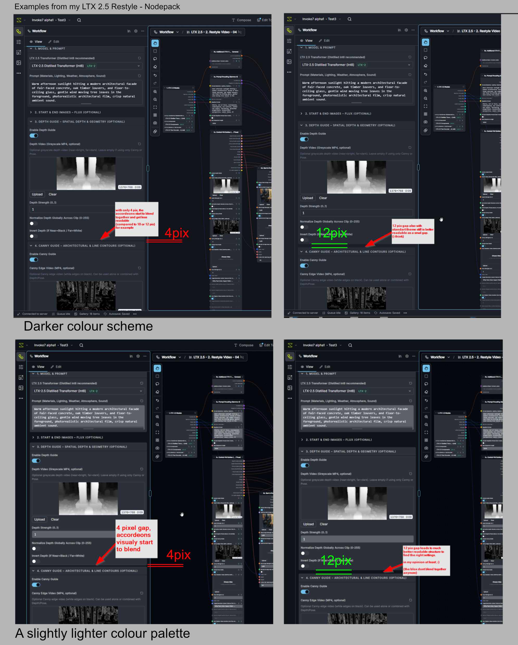
Collapsible sections group related controls into distinct thematic blocks. On the current Generate and Video pages, the outer gap between collapsible sections is 4 px (gap="1"), whereas the spacing between individual fields inside an open section is 12 px (gap="3"). Because the gap between groups is 3× tighter than the gap inside a group, adjacent open sections visually merge into one continuous block rather than reading as separate functional stages.

When you have built the UI yourself and know every parameter and slider by heart, your eye navigates by muscle memory and that tight spacing doesn't get in the way. For occasional users, however, quick visual scanning of functional blocks is essential. Several colleagues at our office compared both variants side by side and found a 10–12 px outer section gap (especially combined with slightly stronger surface contrast between the panel background and open section cards) much easier to scan at a glance. Maybe this makes sense for you. :

Distance Accordeon 2
  • A (top-left): Current 4 px outer gap + default theme contrast (bg.subtle vs. bg.muted is only a 5% OKLCH lightness step, and the 4 px outer gap is tighter than the 12 px inner field gap).
  • B (top-right): 12 px outer gap + default theme contrast.
  • C (bottom-left): 4 px outer gap + slightly increased surface contrast.
  • D (bottom-right): 12 px outer gap + slightly increased surface contrast — thematic blocks immediately read as separate groups.

Greetings from Hamburg.

Tom

This branch has not been deployed

No deployments
Sign up for free to join this conversation on GitHub. Already have an account? Sign in to comment

Labels

7.0.1 frontend PRs that change frontend files

Projects

Status: 7.0.1: bugfixes and small features

Development

Successfully merging this pull request may close these issues.

4 participants